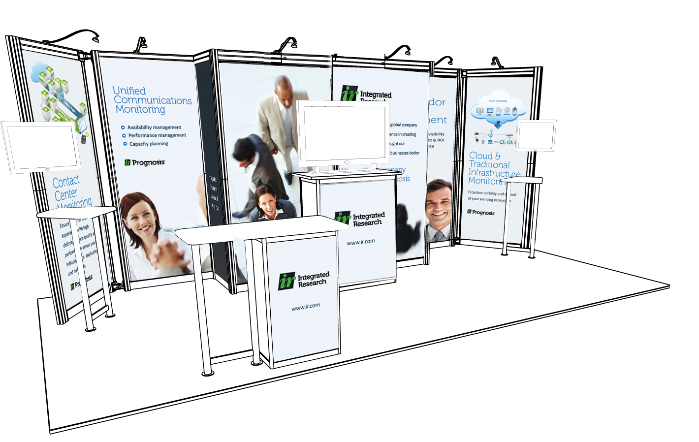
There are many reasons why companies choose to invest and exhibit at tradeshows. While these events provide great brand awareness and networking opportunities, the main reason for participation is lead generation.
If planned properly, with clear objectives and measurable ROI, tradeshows and events can be a valuable element of the marketing mix.
As a writer or Marcoms professional you may be responsible for communicating the overarching message for that event.
Having attended many tradeshows in the UK and Australia, both as an exhibitor and as a visitor, the best advice I can give you is present one clear, concise message and speak directly to your audience.
Here is my checklist of the six sacred points a writer should adhere to when creating booth graphics for tradeshows.
- The logo and company name are the most important items to get right. As a writer you may need to work with the designer to make sure you have provided the correct logo in the correct format, and of course make sure the events company has your company name right.
- Have one clear message – even if you have a number of panels to fill, it is better to have one message that is supported by 2 or 3 key benefit statements or quotes. Forget listing all the features in a product – a booth banner is NOT the place. Keep that for your Technical Specifications leaflet. You may be under pressure from various stakeholders to include as many messages as possible. If you have any influence at all, try and advise that it really is best practice to communicate one clear point and get everyone onboard as to what that message should be.
- Write messaging that provokes a question or answers a need or pain point. Keep in mind the visitor to your booth needs to know ‘what’s in it for them.
- From a visual perspective when you are working with the designer, keep in mind this messaging should be seen from a distance. Make sure sure you have allowed for any tables, monitors or chairs that may sit in front of the booth graphics. You don’t want half your messaging to disappear from view. Keep fonts large, simple and bold.
- Use colour schemes that re-enforce the brand or corporate identity. Also use colour schemes that are relevant to the industry.
- As a writer responsible for these huge banners and posters, make sure you have proofread the content over and over again before the artwork goes off to production. It can be a costly exercise to get mistakes fixed after production, and if time doesn’t allow and you have to go to a show with a mistake it reflects badly on the company. I stress this point because sometimes by the end of the process, it is not you the writer who has lovingly typed up these words. Designers often will re-type rather than cut and past from your original, and even with the best will in the world, sometimes a typo sneaks in.
Of course there are many different type of fairs and tradeshows and it’s important to adapt your messaging and format to suit the event and the audience. Here is an example of a Recruitment Fair banner I worked on recently. I also developed the brochures you can see on the brochure stand.
 Send to Kindle


